One really simple question that occurred to me while playing with all this skiing data is, How many races do these athletes actually do?
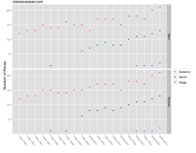
Now, I can’t really answer that completely, since I don’t have every single cross country ski race in existence in my database. Â But what I’m really getting at is the notion that we’ve seen an ever increasing number of races on the international scene:
The stage race refers to the newly adopted Tour de Ski event (and the use of the same format at the World Cup finals this past year). Â But each individual stage in these events is counted among either the distance or sprint events.
With more and more races to choose from each season, are skiers racing a smaller and smaller proportion of them? Â I mean, there’s only so much travel and racing that a person can handle over the course of a season. Â So really what I’m interested in is participation rates. Â What proportion of the available major international races do skiers actually do?
This is actually harder to pinpoint than it seems, as it requires a brief discussion of some nitty gritty details of World Cup racing. Â In general, for World Cup races the number participants is allocated by nation (Olympics and World Championships have analogous but slightly different systems). Â Each nation gets a certain number of spots, based roughly on how good that nation is. Â Norway can start a ton of athletes; Botswana not so much.
However, in addition to these “regular” spots, the host nation for a particular race will get some number of extra spots for it’s athletes. Â These tend to be filled by lower tier skiers who aren’t actually World Cup regulars.
What this means for us is that when you look at every skier for a season and then look at how many races they’ve done, you have a lot of skiers who’ve done only a handful of events. Â Many of these skiers aren’t really in the group I’m interested in, since they aren’t really “World Cup skiers” per se. Â I’m more interested in the people who are actually on their nation’s national team and getting regular opportunities to start a race, even if they don’t take all of them.
So the first thing I’m going to do is to drop skiers who’ve done fewer than three races. Â Arbitrary, I know. Â And technically I’m contaminating things since it’s possible to have some truly elite skier who for whatever reason only does two races (injury, illness, etc.). Â But otherwise these skiers just swamp everything else in the data.
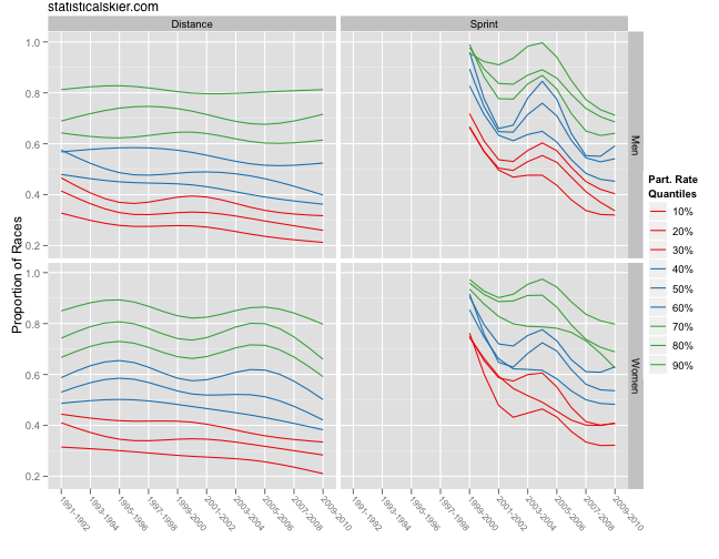
Here’s a graph of participation rates over time by quantile (don’t worry, I’ll explain):
 First, I’ve actually smoothed the data slightly, so these are trend lines, not the raw data. Â I’ll return to the raw values in a moment.
Now, there are a lot of lines floating around here, but don’t despair. Â The vertical axis means just what you think it does: the proportion of races done. Â Now, I’ve included 9 different lines to represent the distribution of participation rates for each season.
I don’t just want to know what the average participation rate is, because in any given season there will be people who do nearly every race, and some people who do only a few. Â I want to track whether each subgroup of participating in more or fewer races. Â For instance, the top green line tracks the participation rate of the 90th percentile group. Â These are the people who do more races that 90% of the skiers that season. Â The level on the y axis is the actual, absolute participation level for that group.
Let’s look at the distance panels first. Â The bottom third with respect to participation rate (red lines) appear to have been slowly dropping. Â So has the middle third (blue lines). Â The top third (green lines) has been more steady, although you see some waving up and down for the women. Â Only 10% of skiers participate in more than 80% of the available distance races in a given season, on average, and that has remained roughly constant for 19 seasons.
The sprint panels are a bit messier, but that is to be expected given the newness of sprinting. Â Early on, pretty much everyone did nearly every sprint race. Â There weren’t very many of them, and there may have been a perception that they were “easy” compared to distance races in terms of how taxing they are on your body.[1. I am most certainly not saying this is true. Â In fact, I suspect it’s just plain false. Â But I’d bet that that perception was fairly common early on with sprinting.]
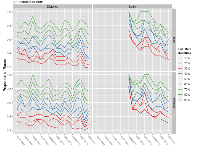
Now I want to return to the un-smoothed, raw data for a moment. Â The reason is that it turns out that the trend lines, while useful for picking out general trends, particularly when I’m plotting 9 lines all on one panel, have obscured something really interesting:
First, now you can see why I smoothed these. Â With this many lines bouncing around, it’s tough to make sense of.
But if you look closely, you can see the hint of some periodic behavior in the distance panels, particularly with the top third green lines. Â In fact, it looks to be dropping every four years or so. Â Hmmmm. Â Wonder why that could be?
The Olympics.
Check the years when the green lines drop; they are Olympic years. Â That’s when many of the top skiers will skip large portions of the World Cup circuit to rest and prepare for the Olympics. Â I could do some fancy autoregression and calculate the lag estimate to confirm this, but really, just look at the graph.
[ad#AdSenseBanner]


{ 2 } Comments